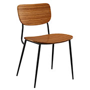
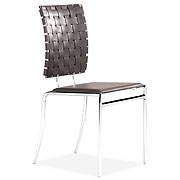
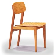
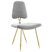
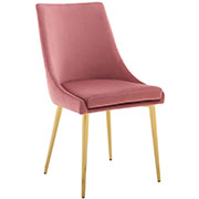
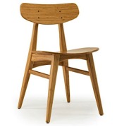
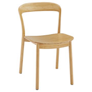
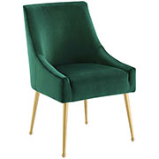
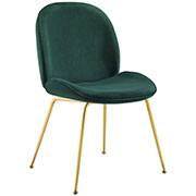
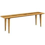
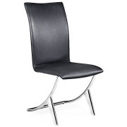
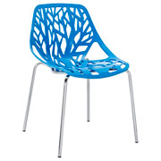
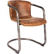
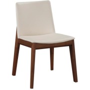
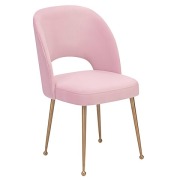
Contemporary & Modern Dining Chairs
Unique, cool dining chairs that blend the very best materials and styles with expert craftsmanship and manufacturing. Modern Digs offers hundreds of the very best models, hand-selected modern and contemporary dining chairs from some of the most reputable furniture designers in the US, Europe and Asia.
The Elements of a Modern Dining Chair
We recently studied hundreds of chair designs to find the very best modern dining chairs ever. Obviously, that task involved a good deal of subjectivity. After all, everyone's tastes differ. Nevertheless, something kept nagging at us. And the more chairs we looked at, the more we started noticing a pattern between all of the designs.
Like we said, not everyone is going to like every chair. And, obviously, several of the chairs on our list were classics. Literally. Designs by Saarinen, Eames, and Mies van der Rohe have been around for decades. They've been featured in countless magazines. Odds are good you'll find at least one of these chairs in some of the most famous buildings in the world. You've seen them on Mad Men, and in practically every home you want to live in. But why?
What makes those designs so appealing? Why have they stood the test of time? And what were we seeing in those designs that felt so... familiar?
It turns out that several of the most famous modern dining chairs in the world actually have some common design elements!
Just to be clear, we're not saying the classics are all alike. On the contrary, there's almost no obvious commonality between a Panton and Eames plywood chair! But there are some definite, subtle trends in the most famous designs. Actually, we found that there were five elements, so to speak. Three elements related to the actual styling of the chair - its lines and shape, and two related to the chair's materials or manufacturing.
Let's Start With Style
Almost every classic chair has a low back. In fact, one of the tallest "classic" chairs is the Louis Ghost chair, but it's only 37-inches tall. None of the modern classics are freakishly short, by any means, but it turns out that a vast majority of contemporary dining chairs that we consider "classic" are low back.
In fact, of our thirty favorites we blogged about, only two chairs were what we would consider high back. (And we should mention that those two designs were crazy anyway!)
So, why is that? It's not like Charles and Ray Eames left a note for Starck that the secret to amazing design is low back chairs. Those designers all arrived to the same conclusion independently.
Instead, we think the low back design is a culmination of a few factors. To start, it's common in design circles to say that high back chairs are traditionally considered "formal." Furthermore, a vast majority of ugly... er, "traditional" dining chairs are high back. A taller back dining chair takes up more space visually, so, in many ways, lower back chairs are bucking several conventions all at once.
Second, low back chairs have a certain geometry we're naturally pre-disposed to enjoy. With a standard seat height of 16-18", any chair that's between 32" and 36" tall is approaching symmetry in the vertical plane. And just like symmetrical faces are more appealing, so goes the low back dining chair!
There's one more upside to designing a chair with a low back that we'll get to later...
Now let's look at the lines and shapes on the classic dining chairs.
Again, there's another pattern. You don't see many angles on those designs. To be sure, there are classic dining chairs with angles. But it turns out the designs that are most replicated and the most ubiquitous, are the simpler, curvier, more organic pieces. And here again, this has to do with two factors:
First, as with most modern and contemporary designs, there's something to be said for bucking tradition. Picture in your mind a dining chair from the 1940's. It's wooden, probably with a spindle back, and, depending on how well off you were, has some sort of ornate touches on the armrests or the top of the back.
Obviously, contemporary designers of the time were going for something completely different than what everyone had, and they chose simplified, more organic lines.
Second, let's not sell the education and experience of these designers short. It turns out that humans are actually programmed to prefer curves to angles; a fact not lost on trained architects like Saarinen and Eames. Several psychological studies have been done to measure how our environments affect our moods, behavior, etc.
As it happens, it's been proven that images of curvilinear objects activate a part of your brain known as the anterior cingulate cortex, an area associated with reward at a far higher rate than rectilinear objects.
That's a little strange when you think about it: scientists were studying how our brains react to shapes. In particular, they correctly hypothesized that we humans are more likely to sense danger and avoid rectilinear objects. But neither bears nor sharks are angular, and you think we would have evolved to avoid those!
Color is the last prominent theme we noticed with regard to design in the classics. Not all of them, obviously. But chairs like the Panton, Louis Ghost, Eames Molded Plastic, and Drop, just to name a few, are all available in an array of colors.
There are actually several good explanations for that as well. Back when the Eames brothers were perfecting their design, the US was going through one of the largest periods of economic growth in the country's history. And coupled with that growth came consumer demand.
What's more, following the Second World War, the country was transitioning back into a peacetime economy. Men and women were leaving factories and returning to the private sector. Men were returning home from war. A generation of kids were coming of age and entering the workforce after two World Wars.
Needless to say, Americans were relatively exhausted by the grays of daily life during wartime. So with this sudden boom in consumerism, there was a corresponding, almost celebratory, boom in consumer demand for colors. Green ovens, pink houses, you name it! The country suddenly wanted to buy more of everything, in more and brighter colors.
And buy we did! Our manufacturing base had matured, and choice was becoming much more commonplace. Don't like the mod plywood dining chair? No worries. How about a chair in blue? Or orange? Or red? Modern manufacturing, for the first time, had made it possible to offer the same products in a vast array of colors for everyone. Why limit your design only to people who like white? Or black?
Now Let's Talk Materials & Manufacturing
The three aforementioned elements (low-backs, curved lines and color) are, what we'd describe as, common in the classic designs. But we've also established that they're not really rules, so much as guidelines. However, there is one attribute that the most famous chairs all share: First-ness.
There's two ways designers have gone about introducing a first.
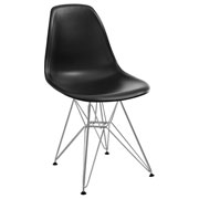
The Eames Molded Plastic Chair is one of, if not THE, most copied chairs on the planet. But it was also a first. Charles and Ray Eames were on a mission to create a modern chair that could be mass-produced and affordable. And so they turned to... Nope, not plastic! That's what we were thinking too.
The original Eames Molded Plastic Chair was actually the Eames Molded Fiberglass Chair. (Plastic has been used since the 80's in the re-issues.) The Eames Chair was the very first of its kind to use a single piece of fiberglass to create the one-piece seat and back.
And not only that, the fiberglass was manufactured in a variety of colors, and left to stand on its own, uncovered. Until the Eames design, fiberglass had been used in furniture, but was always covered with upholstery. Never before had a chair been designed to utilize a hard shell as the chair.
Verner Panton was also a first. His Panton Chair was the first one-piece chair, and also the very first cast completely in plastic.
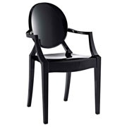
The same goes for the more recent Victoria and Louis Ghost chairs from Starck. The lines of the chairs themselves have been around since the 1700's. But Philippe Starck cast those ancient shapes into a transparent polycarbonate, something that had never been done before.
By re-envisioning a stodgy dining chair from England in a new, modern material, Philippe Starck designed one of the first classics of this century.
Chairs like the Tulip, Louis Ghost and Eames Molded Plastic are the Neil Armstrong's of their materials. Nobody had ever considered using those materials.
But some designers went a different route on their road to first-ness; they used familiar materials in ways that had never been done before.
Actually, the first Eames designs took this approach using plywood. The DCM and DCW both used a commonplace material (wood) in an unconventional way: bending it to create curved surfaces.
As another example, Marcel Breuer's famous Wassily Chair wasn't crafted from materials we'd never seen. Instead he did things with tubular steel and leather that had never been done before. And he carried that idea through to the famous Cesca Dining Chair.
Bent steel tubing seems so common now as to not even be noteworthy, but that's in large part thanks to Breuer's designs. Cesca paved the way to manufacturing techniques that are now used on everything from furniture to ship making!
Lastly, remember how we said there was one more thing about designing a modern chair with a low back? Our theory was that some of the very first classics might actually have been impossible to manufacture in a high back version.
Take the Eames Molded Fiberglass Side Chair. Was there a method in the 50's to produce a high back version of that chair? It turns out no. The original Eames fiberglass shell from 1950 included arms that offered significant support to the overall structure. When they designed the side chair in 1951, according to the official Eames web site, it turned out "it was actually more challenging to design than the armchair because, without arms, the edges where the back met the seat tended to crack."
The same goes for the Series 7 Chair. It's a classic bent plywood design that relies on a narrow connection between the seat and the back. First produced in 1955, we're not confident that a higher back version of that chair would have been possible!
And we have to mention that both of the chairs we just described sound weird, right? Now the question is: are they really weird? Or do they just seem weird because their low back brethren are so ubiquitous?
In Conclusion
So, what does all of this mean? First, in some ways, there's a formula to creating a "classic" modern dining chair. But more importantly, because style is highly personal, you can use these commonalities as sign posts when you're selecting your dining chairs.
Say you're on our site and you find a chair you like. If you're striving for that contemporary or mid-Century look, just consider how your chair stacks up. Is it low back? Are the lines curved, or more angular? Are the materials used common in the classics? Not every classic chair fits into all of the themes we mention, and the chair you find certainly doesn't need to either. However, having an idea how "classic" your dining chair is will keep you in your design lane.
Like a more angular chair? No problem. Maybe pair it with a classic mid-Century table. Or vice versa!


